Do you want to expand your case references? Don’t miss the opportunity to learn about these brand identities projects, they deserve your attention. Dive into the article and discover what makes them stand out. Let’s go there!
Table of Contents
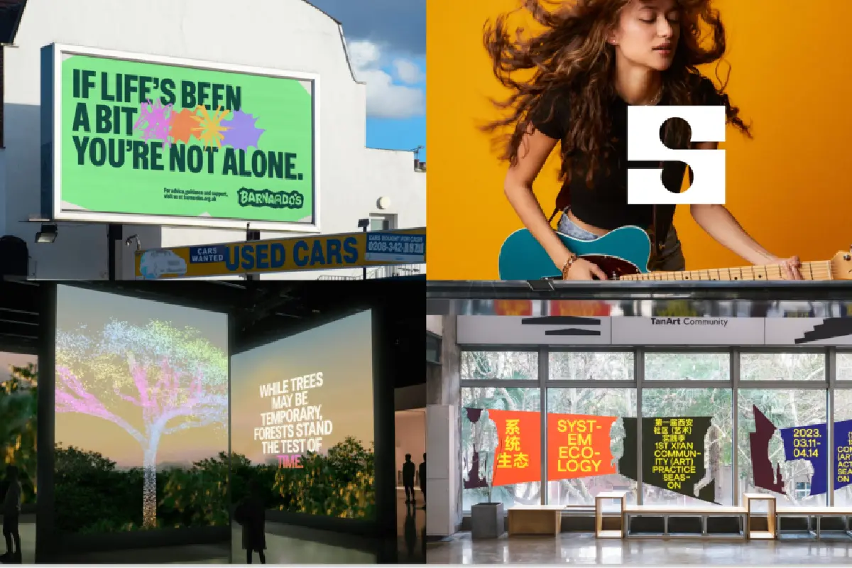
Barnadoes – The Clearing: Draw typography
In this visual identity, it is clear that the brand is designed with children in mind. The main element that conveys this idea is typography in its most impactful resources, which is always a powerful tool to communicate. The flow of playing and experimenting is present in the whole and in the detail of this work.


Come in and enjoy the whole case.
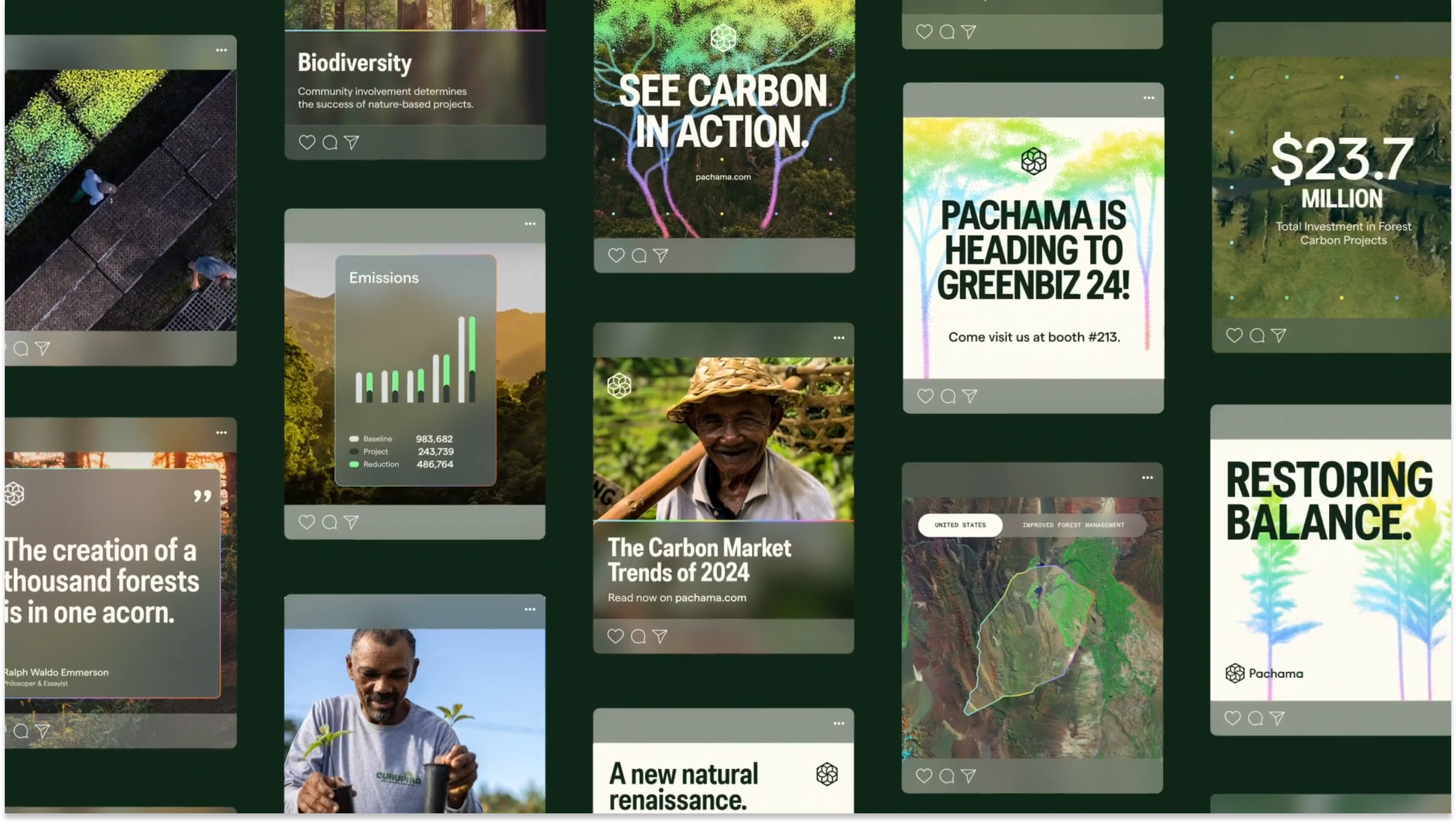
Pachama – How&How: Make the unknown visible
The visual language highlights the value proposition: real-time readings on carbon removal. Thanks to pointillism, color and animation scan and make visible something that often goes unnoticed by our eyes: the processes that develop in nature. A graphic resource that enhances the communication of identity and the conceptual framework of nature and technology.



See the complete work here.
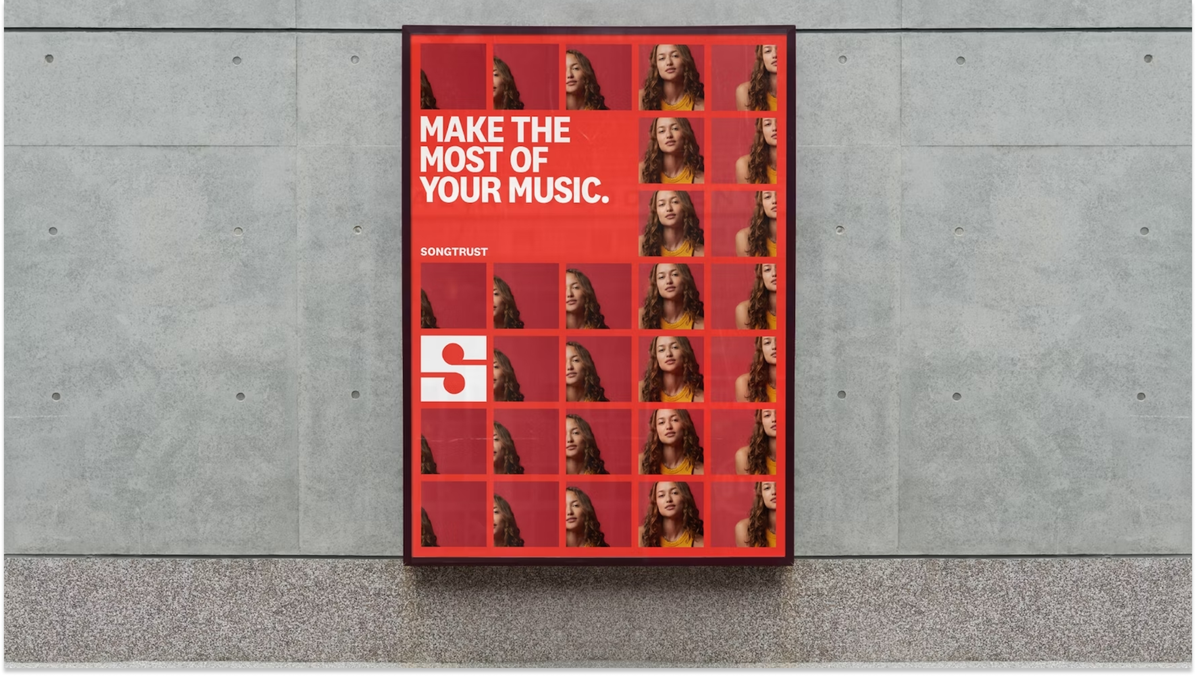
Songtrust – Order: A pentagram as inspiration
An identity must drink from its world. And this is a clear example: the double reading of the symbol and the grid. A symbol that can be two notes or two headphones, it is clear that its world is musical. The reticle, as indicated on the case, draws from the staff and updates it to a modern and flexible visual language. Both in the differential and general pieces. A round brand system.


Take a look at the project.
Xi’An Community (Art) Practice Season – Another lab: Another level to take negative spaces
This work works very well in its digital version, integrating into the photographs, but in its die-cut offline version it is a real marvel. The concept of community, related to the figure of people, is a way of highlighting the main point. What can we learn from this work? The importance of exploring more other cultures and philosophies and their way of designing.


Don’t miss the complete case.
B – Bench – De Form : A bridge from A to B
A library, a bridge and a letter. There’s no more. Actually yes, an armchair. Initially conceived as a piece of furniture, it ends up being an integral part of an identity. It is an important symbolic exercise. It is positive that a brand is part of the culture, but it is even more significant when it is used to enrich it.


Review the project here.
Stay connected to get updates on designing and creativity,
