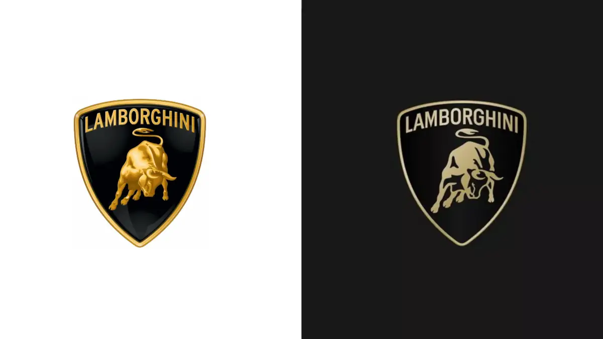
Lamborghini It has a new logo. The famous luxury sports car company today unveiled its new emblem. This image update is the first that the company has carried out in more than 20 years, and is now committed to a flatter and more minimalist design.
The brand thus joins a long list of car manufacturers that have renewed their logo in recent years: Aston Martin, Maserati or Rolls-Royce are just some of the examples.
Table of Contents
This is the new Lamborghini logo
The new Lamborghini logo is still shaped like a shield and its design, in general, remains very similar: the brand name written at the top, just above a bull that seems about to charge.
However, the design becomes much flatter and more minimalist. The frame of the shield is now thinner, while the bull is executed in a more simplified manner, with fewer details. In fact, from now on, the bull will appear individually in the company’s different digital touchpoints, separate from the classic shield.


The new design also features a new custom typography, and the gold color is presented with a lower intensity. The brand explains in its official communications that “white and black are reconfirmed as the primary tones, symbolizing the clear identity of the brand, while yellow, along with the color gold, are used as accent colors.”
The reasons behind Lamborghini’s logo change
This evolution of the logo is part of the transformation process (called Direzione Cor Tauri) that the brand is going through. This new approach is focused on sustainability and decarbonization, with the focus on launching its first electric vehicle by 2028.


