We return from Easter with five designing projects that stand out from the rest for how they use and take advantage of movement in their systems. These are five identities that you should have written down, no matter what, in your reference book.
Warning: It is necessary to get into case studies to enjoy the projects 100%.
Table of Contents
Epidemic Sound – Bold: Concept in form and movement
The concept of using cues in editing software to build motion and graphic systems is very interesting. This technique allows a concept to be represented in multiple ways, providing flexibility in design and consistency in visual identity. A formula that allows movement to be present in any piece. Simple and masterful touch.
Discover the movement of this case here.


Milan Symphony Orchestra – Landor: Scale, repetitions and subtraction
Scale and repetition are resources closely linked to representing movement, but in this case, subtraction adds a new dimension, generating variable forms and counterforms.
A disadvantage of having a movement system with a lot of personality is that you can lose that characteristic in static supports. However, in this case, subtraction makes the identity work just as well in static as in motion. It is a clear example of giving the concept another spin and using up the pencil.


Watch the movement of this identity here.
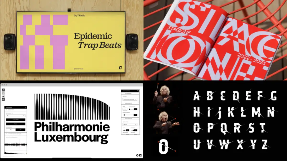
Philarmonie Luxembourg – NB Studio: From building to typography
This identity presents many interesting elements. However, given the current focus on motion and audio, let’s focus on the symbol. Originating from the building, it evolves into a typographic resource, but what is notable is the modification it undergoes with the music. Movement is often associated with spectacularity, but not all identities or gestures need to be striking. Here you can appreciate the beauty of subtlety.


See the entire project here.
Tidal – Vucko: The guidelines make the system
Very fine kinetic identity work. It is noticeable when there are some fundamentals when creating a movement system. Transitions, entries, exits, movement in XYZ… and all starting from the rhombus as the central element of the symbol. A marvel. I wish I could see the manual for this system.


See movement resources here.
London Symphony Orchestra – Design bridge and partners: An almost magical wand
Through the movement of the baton, the typography is intervened to generate the main visual resource. Both the process and the final result of this exercise are fascinating. The typographic detail provides the sensation of rapid movement, while the abstract element effectively represents sound and its fractality. Music, Master!


Review the entire project here.
Don’t miss last week’s cases. Recover them to expand your catalog of references.