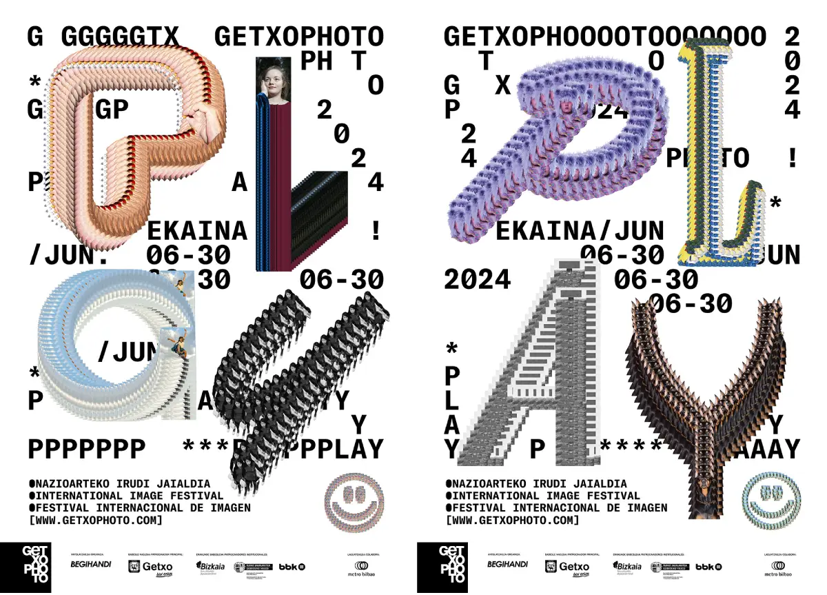
We interviewed Carles Murillo, creator of the avant-garde graphic identity of Getxophoto 2024, where the game becomes a muse and typography becomes a dance. He discovers how “Play” inspires a bold aesthetic that dialogues with the very essence of visual art.
Reflecting the identity of an event in an image or poster is always difficult… but this year the Getxophoto concept has helped you in creating the visual identity. Has “Play” been the conceptual basis for developing it? What challenges did you encounter in developing this year’s image?
This is the fifth edition of the festival that I have designed, and as you mentioned, every year is a challenge, whether due to its own demands (that idea of trying to improve each year), not repeating itself or not being accommodated. Beyond these fears and “traps”, we have very internalized the objectives and needs and both the curator (María Ptqk) and the management and communication team of the Festival are always very open to experimenting and embracing a certain risk, and that is an advantage and at the same time a responsibility. It allows you, even invites you, to explore limits based on that freedom and that inevitably entails more pressure and demands.
The themes raised by the Festival are usually suggestive, but in this case, PLAY (play, experiment, activate) directly pushed you to propose a powerful, restless, fun identity, that plays literally and essentially, that has fun and that entertains. From there I began to think about the idea of how, starting from the artists’ images, I could build or draw with them almost as if they were pieces or brushes. With that starting point and with references such as Paint, generative art, code, 8 bits, etc., I began to define the entire graphic universe, uncomplexed, imperfect, dynamic, with certain rules, but also breaking them. (legibility, for example) and that ultimately transmitted that playful spirit that we all carry within us (or should). As I pointed out flusser one of the theoretical references that a friend (thank you Mercè!) suggested to me when I showed her the previews of the image, “empowering the human being as homo ludens, in his ability to play with the devices he has created, a game that allow yourself to penetrate this “black box” and play with the elements you find therein, but not necessarily as domination, but as mutual affection.”
How do you think the concept of “Play” relates to photography and visual art in general?
It is a very open question and difficult to answer, and perhaps what I am going to say is very obvious but I believe that both photographers and artists, as well as those from other creative disciplines, have, among other things, that common denominator precisely, that concern, desire or need to create, to express, and therefore, inevitably, to play, to imagine one’s own universe and one’s own language. Every creation process, at the end of the day, needs its rules, its context, its pieces and its tools.
Typography also plays, moves, mutates… are these types of flexible identities that are almost an animation in themselves a way to unite motion and graphics?
Yes, in fact, as I told you before, one of the meanings of PLAY is to activate, to move and that is why it seemed to us that this year more than ever we had to make an effort to try to enhance the movement of the different pieces in networks, digital oppis, tourism screens, etc. We are developing the animated pieces in close collaboration with Gerard Mallandrich and with Carlos Castro (Design by Native), looking for a final result that would somehow take us to the beginnings of computer gaming, to the programming and loading pages of the first computers, with an 8-bit mood, glitch, pixels, etc. We are very happy with the result and for having collaborated practically for the first time with Gerard and Carlos; They are very powerful professionals and, in my opinion, the ideal profiles to animate identities.
In the same way we try to make the print pieces look like practically stills of the motion pieces so as not to stop transmitting that idea of action, movement or error, etc., we are not a studio that works or thinks systematically about motion applications or behavior. When we develop projects, we believe that not everything always has to move, so to speak, but in this case it seemed pertinent, inevitable (and desirable) to work along these lines.


Is the repetition of the works of the participating artists also another characteristic element… Do you know that it is a small sacrilege to use the work of another artist to modify it and use it as a graphic element… what kind of impact do you hope to generate?
Well, logically we have asked permission from all the artists by showing them an example of the graphic and we practically have permission from the 22 participants. So far no one has said that they don’t think it’s good or that it seems sacrilege, quite the opposite; They are delighted and happy to participate in the game and to give us their works so that we can build and draw with them. It has come to us very well feedback for his part. Honestly, when I projected the ID I didn’t even consider that it could bother them or that they could cause problems, on the contrary, I think that the proposal has been understood and that they value it. I think that in general people open up when it is the culture that is the flag – to put it in some way – and not the businesses, brands or marketing.
The rules of the game change, logically, and camaraderie, empathy and predisposition are very present in a festival like Getxophoto. When we project, the temptation often appears to “kill” (before they are even born) depending on what approaches or ideas precisely for fear of the problems or difficulties they can generate and, well, the thorniest path can sometimes lead to lead to more satisfactory destinations, even if it suffers a little… With the Getxophoto team we laugh (hysterical laughter, yes) recurrently just about that, about that “getting involved”, about that search for the less smooth paths so to speak.
This year’s image is a good example of a ugly design well used and a way to give identity to a photography event… do you think that festivals, events, concerts… still have a lot to improve, they have more visual scope, to create more dynamic identities… how do you see visual design at the moment? Are there differences between Spain and abroad?
The truth is that I am increasingly saturated and disconnected; The world is too big and I suppose that with too many people producing too many things, it is impossible or impossible to keep up to date. So I wouldn’t know what to answer you, but I imagine that there is still everything: good projects with depth that are not valued as they deserve because it is impossible to do it in 30 seconds of viewing and projects with a lot of “fireworks” that seem to have value and in reality only They are just that, a “pretty face” but deep down they are empty. I also don’t think that identities have to all be super dynamic, it will depend on each case and project, but the truth is that communication needs have changed and the formats to which an ID can be adapted are increasingly diverse and complex.
In any case, sometimes we forget that, in the case of festivals, the projects have life beyond the networks or communication channels works, with the signage, the billboards, the publication, the street oppies, the festival team, etc. It is much more complex… evaluating the design of a festival by the 5-10-20 images or videos that we see is still superficial. In the same way as evaluating a book based on the photos we see, we are not evaluating the weight, the weight of the pages, their smell, the finishes, etc. and it is a very important part of the project.

Didn’t the AI tempt you to ‘play’ with it? The “Play” concept seems almost done on purpose…
Honestly no. I have not yet jumped headlong into AI and I think it would have been suicide to do so in this specific project. I think it’s too complex or I’m too control freak to trust an AI that I haven’t yet mastered and, honestly, that I still distrust. I recently read that Miguel Milà said that Designing is seeing life with a magnifying glass and I think that sense for detail, precision, etc. It is not yet within the reach of AI. I suppose the AI is fast and very powerful, but not as accurate, precise or detailed as the design requires or, at least, as I understand the design.
It is a very powerful tool, obviously, but it represents such a radical change in the processes that I think it needs more time to settle and reflect to know if it suits me or not and when it suits me or not. I also tell you that I am never one of those who jump head first and without thinking into the “small steps of man and great leaps for humanity.”
I still cook the escudella at Christmas making chup chup on the stove… at home we use the Thermomix the same as the Emilio Robot ;). And there was something that seemed very interesting to me – and that this question precisely reaffirms – and it is that idea of “AI without AI”: precisely proposing an identity and a system that seemed focused on being worked with AI, but doing so in collaboration with the “classic” machine in what is being a kind of artisanal collaboration and tailoring work between man and machine, with an almost retro-futuristic result that takes us to the beginnings of the video game, programming, etc. That said, I imagine that yes, in other hands AI would have been the most optimal/shortest path.

About Studio Carles Murillo
Carles Murillo (Barcelona, 1980) is an independent graphic designer, creative and art director based in Barcelona. His work has been awarded on several occasions at the Laus Awards, Daniel Gil Awards (Visual), Art Directors Club of New York, Art Directors Club of Europe, Tokyo Type Director’s Club, etc. and has also been published in various national and international publications. More info: @carles_m
About Getxophoto
Getxophoto is a festival focused on image that has taken place in Getxo –Basque Country– since 2007, created and managed by Begihandi. Thematic in nature, it is conceived as a platform from which current challenges are addressed through different proposals by visual storytellers from around the world with the aim of creating spaces for reflection and establishing a collective conversation.


