Color is one of the most powerful tools in a brand designer’s arsenal. The right use of color theory can evoke emotions, communicate brand values, and create visual impact. But how do you choose the right colors for your brand? That’s where color theory comes in. This comprehensive guide covers everything you need to know about color and its theory and how to use it to create effective brand design.
Table of Contents
Understanding Color Theory
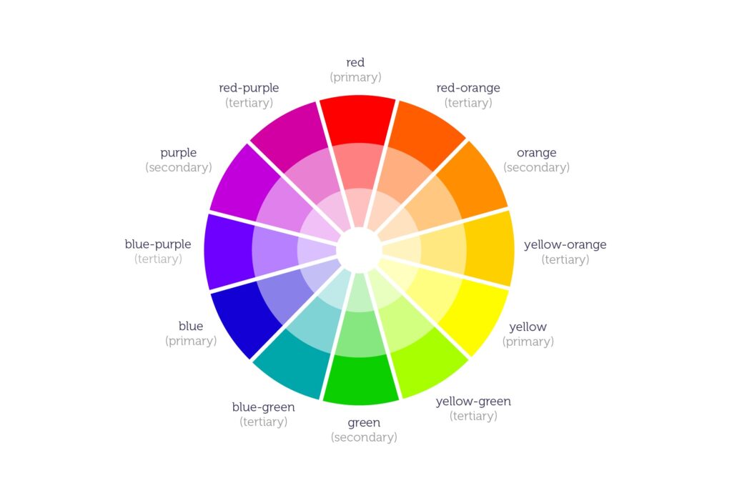
Color theory is the study of how colors interact and how they can be combined to create harmonious and effective designs. The color wheel is the foundation of color theory and consists of primary, secondary, and tertiary colors. Understanding the relationships between colors, such as complementary and analogous color combinations, is key to creating cohesive and impactful brand design.
The Meanings of Colors
Each color has its own unique meaning and connotations. For example, blue is often associated with trust and stability, while green is associated with growth and renewal. It’s important to consider the meanings of colors when choosing the right ones for your brand, as they can help communicate your brand values and messages. Such knowledgeable professionals have many good design jobs in industry.
Choosing Colors for Your Brand
Choosing the right colors for your brand requires a thoughtful and strategic approach. Consider your brand values, target audience, and the emotional responses you want to evoke. Use color psychology and color symbolism to make informed decisions about which colors to use in your brand design.
Consistency and Contrast
Consistency is key in brand design, and color is no exception. Use a consistent color palette throughout your branding materials to create a cohesive look and feel. However, don’t be afraid to use contrast to create visual interest and impact. High contrast color combinations can be used to draw attention and create visual hierarchy in your designs.
Color in Web and UI Design
In web and UI design, color plays an important role in creating user-friendly and accessible interfaces. Consider color accessibility and contrast ratios to ensure that your website or app is usable for everyone, regardless of visual impairment.
Trends and Evolving Color Palettes
Color trends come and go, but it’s important to choose colors that align with your brand values and will endure over time. However, don’t be afraid to experiment and evolve your color palette as your brand evolves. Regularly review and update your color palette to keep it fresh and relevant.
Real-World Examples
To better understand the power of color in brand design, let’s take a look at some real-world examples. Apple is known for its minimalist and sophisticated use of color, primarily relying on white, silver, and black. This creates a clean and modern look that aligns with their brand values of innovation and simplicity. Coca-Cola, on the other hand, uses a bold and vibrant red color to communicate energy, excitement, and fun. The consistent use of this red color across all their branding materials reinforces their brand identity and creates instant recognition. Many more examples you can see in stock graphics websites like freepik where many projects are published.
Conclusion

Color is a powerful tool in brand design, and understanding color theory is key to creating effective and impactful branding. By considering color meanings, choosing a consistent and contrasting color palette, and incorporating color into web and UI design, you can elevate your brand and create memorable and engaging designs. Whether you’re a seasoned brand designer or just starting out, incorporating color theory into your work will help you create brands that stand out and make a lasting impression.


