During my whole designing career, I have learned that Colors play a significant role in our lives, evoking emotions, creating moods, and influencing our perceptions. Among the vast spectrum of colors, pastel colors have gained popularity for their soft, soothing, and serene aesthetic appeal. Pastel color palette, characterized by light and muted shades of colors, has been widely used in various forms of art, design, fashion, and home decor. We will delve into the captivating world of pastel colors and its color theory, exploring their history, characteristics, psychology, and versatility in different fields.
Table of Contents
History of Pastel Colors:
Pastel colors have been used in art and design for centuries, dating back to ancient times. In ancient Egypt, pastel pigments made from ground minerals and natural pigments were used to create exquisite murals and frescoes in temples and tombs. Pastel colors also gained popularity during the Renaissance era, with artists such as Leonardo da Vinci and Michelangelo using soft and muted colors in their paintings to create subtle shading and depth.
The term “pastel” originated from the French word “pastellum,” meaning paste or crayon. Pastels, as we know them today, became popular in the 18th century, with the invention of pastel chalks by French artist and scientist Jean-Baptiste Perrin. These soft, powdery chalks made from pure pigments mixed with a binder allowed artists to create delicate, luminous, and velvety effects on paper or canvas.
Characteristics of Pastel Colors:
Pastel colors are characterized by their light and muted shades, often achieved by adding white or gray to pure pigments. These colors have low saturation and intensity compared to their brighter counterparts and are often described as soft, subdued, and calming. Some common pastel colors include pale pink, baby blue, mint green, lavender, peach, and soft yellow, among others.
One of the distinctive characteristics of pastel colors is their ability to create a sense of harmony and balance. Pastel color palette often includes colors that are close in hue and value, resulting in a gentle and cohesive color scheme. Pastel colors are also known for their versatility, as they can be used in various combinations and easily paired with other colors to create different moods and effects.
Psychology of Pastel Colors:
Colors have psychological effects on our emotions and perceptions, and pastel colors are no exception. Pastel colors are often associated with positive emotions such as calmness, serenity, innocence, and sweetness. They are known to evoke a sense of nostalgia, reminiscent of childhood memories and innocence. Pastel colors are also often used to convey a sense of femininity, tenderness, and delicacy.
In addition to their emotional impact, pastel colors are also believed to have a physical effect on our perception of space. Light and muted colors tend to recede visually, making a space appear larger, airy, and open. This makes pastel colors ideal for creating a sense of spaciousness and tranquility in interior design, where they are often used for walls, furniture, and accessories.
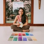
5 Key Pastel Colors
Pastel Blue:
Pastel blue is a soft, muted shade of blue that evokes a sense of tranquility and calmness. It is often associated with serenity, freshness, and a feeling of openness. Pastel blue can be used to create a soothing and relaxing atmosphere in design, and is commonly used in interior design, fashion, and web design for its gentle and peaceful appeal.
Pastel Green:
Pastel green is a muted shade of green that conveys a sense of nature, freshness, and renewal. It is often associated with growth, vitality, and balance. Pastel green is commonly used in design to create a calming and rejuvenating effect, and is often used in branding for environmentally-friendly or organic products. It can also be used to add a touch of natural elegance to various design projects, such as packaging, stationery, and home decor.
Pastel Yellow:
Pastel yellow is a soft, muted shade of yellow that exudes warmth, cheerfulness, and optimism. It is often associated with sunshine, joy, and happiness. Pastel yellow can be used to add a cheerful and uplifting vibe to design projects, such as invitations, banners, and promotional materials. It is also commonly used in nursery decor, baby products, and spring-themed designs for its light and playful nature.
Pastel Pink:
Pastel pink is a gentle, muted shade of pink that embodies sweetness, femininity, and innocence. It is often associated with romance, tenderness, and softness. Pastel pink is commonly used in design for feminine and delicate aesthetics, such as in fashion, cosmetics, and wedding-related materials. It can also be used to create a vintage or retro vibe, and is often combined with other pastel colors to create a harmonious and charming palette.
Pastel Purple:
Pastel purple is a soft, muted shade of purple that conveys a sense of elegance, sophistication, and mystery. It is often associated with creativity, spirituality, and luxury. Pastel purple is commonly used in design for its refined and sophisticated appeal, and is often used in branding for beauty, fashion, and lifestyle products. It can also be used to create a dreamy and ethereal atmosphere in various design projects, such as invitations, packaging, and home decor.
| Color | Hex Code |
|---|---|
| Pastel Blue | #AEC6CF |
| Pastel Green | #77DD77 |
| Pastel Yellow | #FDFD96 |
| Pastel Pink | #F8C8DC |
| Pastel Purple | #F2A2E8 |
Versatility of Pastel Colors in Different Fields:
Pastel colors have found their way into various fields, including art, fashion, design, and home decor, due to their versatility and aesthetic appeal.
Art:
Pastel colors have been widely used in art, particularly in painting and drawing. Pastel chalks, with their soft and powdery texture, allow artists to create delicate and nuanced effects on paper or canvas. Pastel colors are often used for portraits, landscapes, and still life paintings, where they can add depth, luminosity, and a sense of atmosphere to the artwork. Pastel artists often use pastel colors to create subtle shading and highlights, resulting in a soft and realistic look. Pastel colors are also popular in abstract art, where they can be used to create dreamy, ethereal, and otherworldly effects.
Fashion:
Pastel colors have been a staple in fashion, particularly in spring and summer collections. Pastel-colored clothing and accessories are often associated with a fresh, youthful, and feminine look. Soft pink, lilac, mint green, and baby blue are common pastel colors used in fashion, appearing in dresses, tops, skirts, and accessories. Pastel colors are also popular in men’s fashion, with muted shades of pastel colors used in shirts, ties, and accessories for a sophisticated and refined look.
Design:
Pastel colors have made their mark in various design fields, including graphic design, web design, interior design, and product design. In graphic design, pastel colors are often used to create gentle and soothing visual experiences in logos, branding, and marketing materials. Pastel colors are also popular in web design, where they can create a clean and minimalistic look, or add a touch of playfulness and whimsy to a website.
In interior design, pastel colors are used to create serene and calming spaces. Pastel-colored walls, furniture, and accessories can add a touch of elegance, warmth, and sophistication to a room. Pastel colors are also commonly used in nursery and children’s room decor, creating a soft and soothing ambiance.
Home Decor:
Pastel colors have become increasingly popular in home decor, with interior designers and homeowners using them to create stylish and inviting living spaces. Pastel-colored furniture, rugs, curtains, and decorative accessories can add a touch of elegance and charm to a room. Soft pastel colors are often used in home decor for their ability to create a serene and welcoming atmosphere, making them ideal for bedrooms, living rooms, and dining rooms. Color me mine is also ding such work with kids where kids do pottery art and color them.
Conclusion:

The pastel color palette has a timeless and versatile appeal that has captured the hearts of artists, fashion designers, interior designers, and homeowners alike. With their soft and muted shades, pastel colors evoke a sense of serenity, innocence, and elegance. They are known for their ability to create harmonious and cohesive color schemes, and their versatility makes them suitable for various fields of art, fashion, design, and home decor. Whether it’s in a painting, a piece of clothing, a website, or a room, pastel colors continue to be a beloved choice for those seeking a soft and serene aesthetic that transcends trends and time.
FAQs
What is a pastel color palette?
A pastel color palette consists of soft and muted colors that are less saturated and have a gentle, delicate appearance.
What are the 4 main pastel colors?
The four main pastel colors are soft pink, lilac, mint green, and baby blue.
What are the best pastel color combinations?
Some popular pastel color combinations include soft pink and mint green, lilac and baby blue, and peach and light yellow.
What are 2 complementary pastel colors?
Two complementary pastel colors are mint green and coral, and baby blue and peach.