QR codes have become a simple way to connect something people see in the real world with something they can open on their phone. You can find them on business cards, product packaging, restaurant menus, posters, event invitations, store displays, and even social media graphics.
A plain black-and-white QR code works well, but it doesn’t always fit the design. If you’re creating something for a brand, adding a logo or changing the colors can make the QR code feel like part of the design instead of an object placed on top of it.
The important part is making those changes without affecting readability.
Table of Contents
Start With the Right QR Code Content
Before worrying about colors or logos, decide what the QR code should open.
For a website, use the exact page URL you want visitors to reach. For a business card, you might use a contact page. A restaurant could link to its digital menu, while an event organizer could send visitors to a registration page.
Keep the destination as simple as possible. A QR code has to store the information you give it, and more data can result in a more complicated code with more small modules.
Once your destination is ready, you can create your QR code using a QR code generator with logo and customize its appearance.
Add Your Logo Carefully
Putting a logo in the center of a QR code is one of the easiest ways to give it a branded appearance. But the logo shouldn’t cover too much of the code.
QR codes have built-in error correction, which allows a scanner to recover some damaged or obscured data. There are four standard error correction levels, with higher levels providing greater correction capability at the cost of additional data and a larger code.
That doesn’t mean you can cover a large section of a QR code and expect every phone to scan it.
A good approach is to keep the logo relatively small, give it enough contrast, and test the finished code with several phones before using it publicly.
Keep Enough Contrast
A QR code doesn’t have to be black and white, but there needs to be a clear visual difference between the code and its background.
For example, a dark blue QR code on a white background is generally easier to distinguish than a pale blue code on a light gray background.
Be particularly careful with gradients, photographs, textures, and busy backgrounds. They may look attractive in a design mockup but can make the individual modules harder for a camera to identify.
If your QR code is going onto a poster or packaging, check the actual size and background where it will be printed rather than judging it only on your computer screen.
Don’t Remove the Empty Space Around the Code
One of the easiest mistakes to make is putting other design elements too close to the QR code.
QR codes need a clear margin around the outside, commonly called the quiet zone. The standard requires a margin equivalent to four modules around the symbol.
That means you shouldn’t place text, borders, illustrations, or other graphics directly against the code.
Think of this empty space as part of the QR code itself. It may look unnecessary from a design perspective, but it helps scanners distinguish the code from everything around it.
Make the QR Code Large Enough
A QR code that looks perfect on your laptop can become difficult to scan when printed very small.
The correct size depends on factors such as the amount of information encoded, the printing method, viewing distance, and the environment where it will be scanned.
If you’re putting a QR code on a business card, test the printed card at its actual size. If you’re designing a large poster, stand at the distance where people are expected to scan it and test from there.
The goal isn’t simply to make the QR code as large as possible. It’s to make it comfortably scannable for its intended use.
Test Before Publishing
Always scan the finished QR code before sending the design to print or publishing it online.
Try it under realistic conditions:
- Scan it from different distances.
- Test it on more than one phone.
- Check it in normal indoor and outdoor lighting.
- Test the actual printed version if it will be printed.
- Make sure the destination page opens correctly.
- Check that the logo, colors, and styling haven’t affected readability.
QR Code standards specifically warn that distorted modules, insufficient margins, and graphics placed over important areas can make codes difficult or impossible to read.
A five-second scan test can save you from discovering a problem after hundreds of business cards or flyers have already been printed.
QR Codes Can Still Look Good
A QR code doesn’t have to be treated as a boring technical element.
You can match it to a brand’s visual identity with appropriate colors, a logo, and a clean surrounding layout. The trick is to treat readability as the first requirement and styling as the second.
Start with a working QR code, customize it gradually, and test each major change.
For designers, this is usually a better approach than trying to make the code look unusual from the beginning.
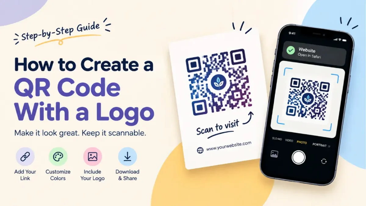
Create a QR Code With Your Logo
If you already have the destination URL ready, you can create a branded QR code and add your logo directly.
Create your QR code with logo using the free QR Code Generator by GraphicsGaga.
Whether you’re making a business card, restaurant menu, product label, event poster, or social media graphic, test the final version in the environment where people will actually use it.
A QR code’s job is simple: get someone from the physical design to the digital destination. Good styling should make it fit the design without getting in the way of that job.